During her UCLA course, media arts design student Amy Fang made a publication called TypeUnseen, focusing on the textual element, creative typography, and the trend of brutalism in graphic design.
How do contemporary graphic designers utilize illegibility within the art of typography? Type Unseen is a reader on designed illegibility and visual nonsense; it analyzes the influence our youth culture has had on experimental typography, all the while exploring the multitude of philosophies that drive us to construct and deconstruct meaning.
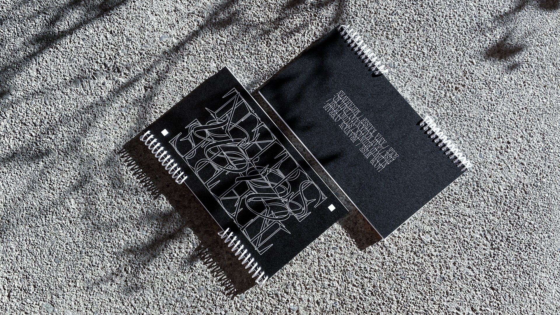
Type Unseen was conceptualized in early 2020 as a means to uncover trends followed by young typographic designers, championing abstract experimentation and ornamentation over meaning. The book is a compendium of ten case studies, catalogued within four different sections: showcasing typography as image and pure form; as a means of producing identity; as a catalyst for protest; and as a way of being. However, in the context of a year shaped by a global health crisis and racial reckoning, Type Unseen asks another question for young designers—what messages will ultimately materialize and shape the aesthetics of our generation?
The book typography uses Suisse Int’l as text typeface, with Charon, Deformi, Euphoria, and Al Fresco for display. In addition, Amy Fang includes a spread with a quote by Michael Bierut in which “he contemplates his jump from typographic fidelity while working for [Massimo] Vignelli, to typographic promiscuity.” She has set his words in 25 typefaces, “some of the craziest I’ve collected over the past year.”
Designers/Agencies